

The biggest news in the past few weeks is that I've got the immense privilege of colouring the fantastic Santa Claus vs the Nazis for David Lloyd's Aces Weekly. I've taken over from the hugely talented Miroslav Mrva who's coloured the majority of the book. It's a brilliantly fun tale that does what it says on the tin AND HOW - written and lettered by the amazing Ben Dickson and illustrated by bonafide artgod Gavin Mitchell. It's currenly running THIS VERY MOMENT over in the seventh volume of Aces Weekly which is cheap as chips and chock full of hits - http://acesweekly.co.uk/shop
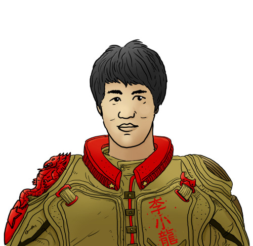
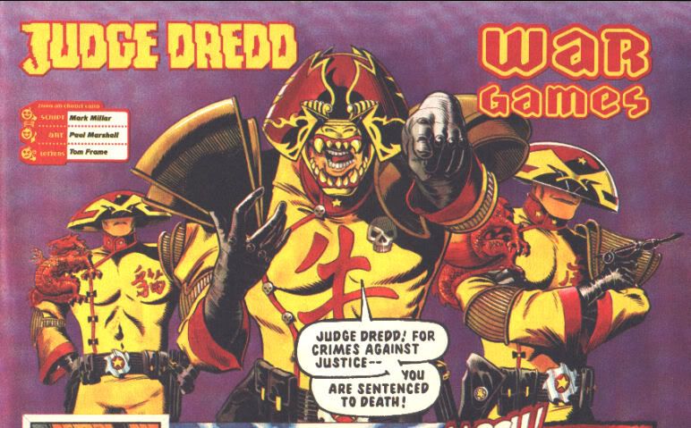
Above is my Bruce Lee Dreddhead - the first (that I know of) "Sino-Cit" version of the Judge uniform. Based on this bit of Dredd continuity cake. *Shudder* Apologies for the Millar, not sure if the look was designed by artist Paul Marshall or whether Millar in a fit of stereotyping madness scrawled it on the back of a greasy napkin. Either way, canon it be. I hope I get the chance to adapt some more world judge uniforms soon, the next one will hail from Collinsport.
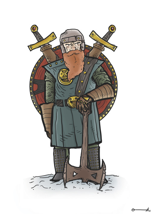
I have drawn a dwarf - needless to say the central idea came from confirmed fantasynut Geoffery Crescent - but the theme was "weaponry" so a heavily-armed dwarf was called for! This will show up as a print at Thought Bubble and beyond so if you fancy this on a bit of card then hunt me down and harpoon me through the face with coins. Over half a year ago 'twas the mighty Cardiff con - that sadly it was recently announced wouldn't return in 2014. Which is a shame and it'll be a much-missed date on the calendar. Either way - I'm still working my way through the small press stash I got there so here's another review...

There was a lot of buzz already surrounding Razarhawk before it launched at Cardiff '13 - the story having been in development and teased long beforehand. I snapped it up without hesitation. What you get is a solid bit of likeably punchy small pressery - that is deceptively simple on the surface. It manages to tell an engaging story without filling you in on any background details whatsoever, which is a difficult trapeze to walk but Razarhawk #1 manages it admirably. The action is well-handled and it rattles along at a brilliant pace, but here's hoping Issue 2 (still deep in my to-read pile) fills in some of the gaps and gives this fun and open start a bit more weight. It's not perfect however; Dean's constant use of "shit" falls on the wrong side of funny repetition and becomes irritating quickly - also a few irksome memey manga moments aren't to my taste like using action words in asterisks in dialogue *cringe*. Abram's art is a great fit, being refreshingly straightforward and also brilliantly emotive at once - the sense of movement and expression seems effortless and make it clear there's an animator at work here. There is a problem with line-thickness though that make some locations particularly look a little too clumpy but nothing is unreadable or unclear which is an enviable skill. The colouring ranges from the subtly shaded to the flat, and I much preferred the panels with shading than without - the most striking images being the ones with harsh or bold lighting. Dani's lettering is solid, managing a range of effects smartly and using a neat squarish box for dialogue although SFX instead of boxes for the screams of some pedestrians may have fitted better. It's printed with a nice thick cover and there's tons of space on the inside front, inside back and back that could've been used for exposition or explanation but instead leaves three nice big canvases for Dani to doodle on at conventions! A solid and likeable read from Matthews and Abram - I'm greatly looking forward to getting further into Kitty Hawk's world.